| View previous topic :: View next topic |
|
|
re: Site Update
on 03-01-2016 7:19

Just to give Notice that I'm going to be having a fiddle with the website layout. Our host has been running two different versions of their sites for some time now (Version 4 and Version 5). We've stayed with Version 4, whilst testing out Version 5 (for example on the Light Wolves site). Version 5 has been in Beta for some time and has had lots of updates, mainly to allow the site to work better and more cleanly, but there have been some problems, and some of the options easily available on V4 have not been there on V5.
It looks like Version 5 is now a lot closer to completion, so I'm going to potentially change us over. If you notice any major problems, please let me know.
|
|
|
|
re: Site Update
on 03-01-2016 9:19
The update has messed up the layout on the mobile version, at least on mine anyway. Everything in bunched up in a column on one half of the screen and it's not easy to use this way. I'll have to log in to my pc and have a proper look later
<a href="http://www.mylivesignature.com" target="_blank"><img src="http://signatures.mylivesignature.com/54494/270/0BFA1350AE6CEB475F92F03C6E87AF30.png" style="border: 0 !important; background: transparent;"/></a>
|
|
|
|
re: Site Update
on 03-01-2016 9:33
way worse looking than the old site.
|
|
|
|
re: Site Update
on 03-01-2016 9:48
Ooh looking at it on my PC I really like it. Nice and organized, on the phone it is squished but on the PC it looks good. It's a lot more open than the old one, the menu bar is a lot more prominent too.
<a href="http://www.mylivesignature.com" target="_blank"><img src="http://signatures.mylivesignature.com/54494/270/0BFA1350AE6CEB475F92F03C6E87AF30.png" style="border: 0 !important; background: transparent;"/></a>
|
|
|
|
re: Site Update
on 03-01-2016 11:51
Just bear in mind I've literally just punched the button to switch, so not had much time to neaten it up yet .. and I might have to go in and learn a bit of CSS to sort some of the stuff out. It IS supposed to be better on mobiles, but if there are major problems that can't be solved, I'll just switch it back.
Some of the things I need to sort out are transparencies, the look of the forums a bit (I've not even really checked them properly yet), the overall look of the header and background - and some of the widths seem a bit hinky.
@Biffa .. is there something specifically you prefer on the old site that isn't showing on the new? It may be something I can fix.
|
|
|
|
re: Site Update
on 03-01-2016 12:19
Don't like the way it looks. Proportions are all wrong. Much prefer the earlier version tbh
|
|
|
|
re: Site Update
on 03-01-2016 12:52
Perspicacia wrote:
Don't like the way it looks. Proportions are all wrong. Much prefer the earlier version tbh
Can you give me specifics, persp? I'm currently working on it to see if it's something I can adjust .. some bits of the site are much easier to view and deal with than the old version (forums, once I get them working properly, for example), but if I can't sort it, I'll just have to switch it back.
|
|
|
|
re: Site Update
on 04-01-2016 6:06
just looks very generic and cluttered to me like a specific section of the forum doesnt stand out because they all the same colour .
|
|
|
|
re: Site Update
on 04-01-2016 8:41
Biffa wrote:
just looks very generic and cluttered to me like a specific section of the forum doesnt stand out because they all the same colour .
If you mean the links to the sub-forums .. you're right .. I've noticed that too, along with the colour of all hyperlinks (other than the ones to quests on wowhead) .. it's something I should be able to change once I work out the code for it.
Another thing I'm trying to sort out is the transparency of the main screen so that you can see some of the background through it, together with hopefully alternating colours for alternating forum posts on a forum thread.
The alternative on the main home page to reduce some of the clutter is either remove some of the widgets (ie, the smaller boxes of content either side of the main central section), or change to a 2 column layout (from the current 3).
Most of it (other than the current colour problems with the forum and hyperlinks, and the transparencies) is very similar to the old site - but yes currently it doesn't look at polished. Blame that partly on me being bored yesterday morning, and then not having time to finish playing in the afternoon :p
The advantages, however, include a much easier and better looking forum overall - it is easier to copy/paste items into it, including pictures and links, and the formatting is a little easier to deal with.
The disadvantages include the fact that, as they've made the admin "easier", it means there are less options unless you know how to write css :p
|
|
|
|
re: Site Update
on 04-01-2016 12:07
Just had a look around and everything looks like everything else, far more tricky to pick out what forums/threads you wanna read.
Overall not happy with the new look yet, too much grey. Just like my hair now, so It could just be me being grumpy:P
|
|
|
|
re: Site Update
on 04-01-2016 13:36
I've sent a message to Support and just waiting to hear back. I think one of the problems is that I manually altered some of the css on the previous site - primarily through options in the admin panel. The new site doesn't have those options - in order to amend the css you have to simply update the css file, and I'm a complete noob at that type of thing.
What I probably should have done, had I realised, prior to clicking the button to switch over, was remove all the amended css so that it didn't affect the newer site.
The solid grey content background is something I'm looking into sorting, together with the colour of hyperlinks.
Is the problem with the forums simply the colour of the sub-forum links or is there something else going on?
For reference, the site used to look like the screenshots in these blogs:
http://www.gamerlaunch.com/blog/good-first-impressions-why-our-favorite-gamer-launch-sites-are-so-effective/
http://www.gamerlaunch.com/blog/our-favorite-gamer-launch-sites-engage-their-communities-in-style/
.. the intention is to get similar to that, but with the added functionality (mainly background stuff) of the new version.
I have, however, asked the question about how the site would be affected if we simply reverted back to the old version.
*Edit .. and note that since some conversation about the forums and the site, I have tweaked a little, so please do have a quick look to see if it's any better 
|
|
|
|
re: Site Update
on 04-01-2016 15:28
Been looking around, already with your tweeks it looks a lot better..easier to see forums/threads/links.
So whatever you did..Yay!!
I have every faith you'll get it looking awesome again in no time PE 
|
|
|
|
re: Site Update
on 04-01-2016 15:55
Fingers crossed! My aim is to get is looking fairly similar to the previous site. There are some things I've been tweaking .. and some things are fairly easily dealt with once I've got the time, such as the words on the tab in your browser (currently it says something like "Dark Wolves in WoW on Lightbringer" which seems a bit weird) and the heading title, which I'm not really 100% happy with.
Some things also seem to look different depending on the browser you view through .. Edge shows the home page with a gap at the bottom on the background, for example, and it also shows some of the widgets weirdly. As long as most of the major things are sorted, and it's useable and viewable, and I'm going in the right direction, then that's the main thing. As I'm now back at work it may take some time .. but I will be working on it whenever I get some (and my brain is in gear!).
Speaking of which .. if anyone knows of any good idiot guides online for css that would be cool. Basically the site has a .css input box, so I can add individual little bits of code to change things, but I'm finding it rather difficult to track down specifics (as in why do some command lines start with # and some with .) and what different parts of a site are called, and how nesting (if css uses it) works.
I managed to find the command to keep the background static, but still looking for a way to have the background all the way to the top (ie, the bit behind our guild name) and keep all of it static - currently the header image is a different image (a seperate one, although the same image) to the page background one, which leads to some weird looking jinks. It's not awful, but it's not perfect.
|
|
|
|
re: Site Update
on 05-01-2016 8:46
I think my main complaint is that there is too much empty space so that the proportion of actual useful stuff compared with useless empty space is all wrong. I will have another look at it and see if there is anything else I can add to that
Perspi
|
|
|
|
re: Site Update
on 05-01-2016 9:58
Perspicacia wrote:
I think my main complaint is that there is too much empty space so that the proportion of actual useful stuff compared with useless empty space is all wrong. I will have another look at it and see if there is anything else I can add to that
Perspi
Could you be more specific persp? Where is the empty space? Is it on the home page or the forums, or another page? When you say empty space .. does something not look like it "fits" fully, or are there gaps where something is missing?
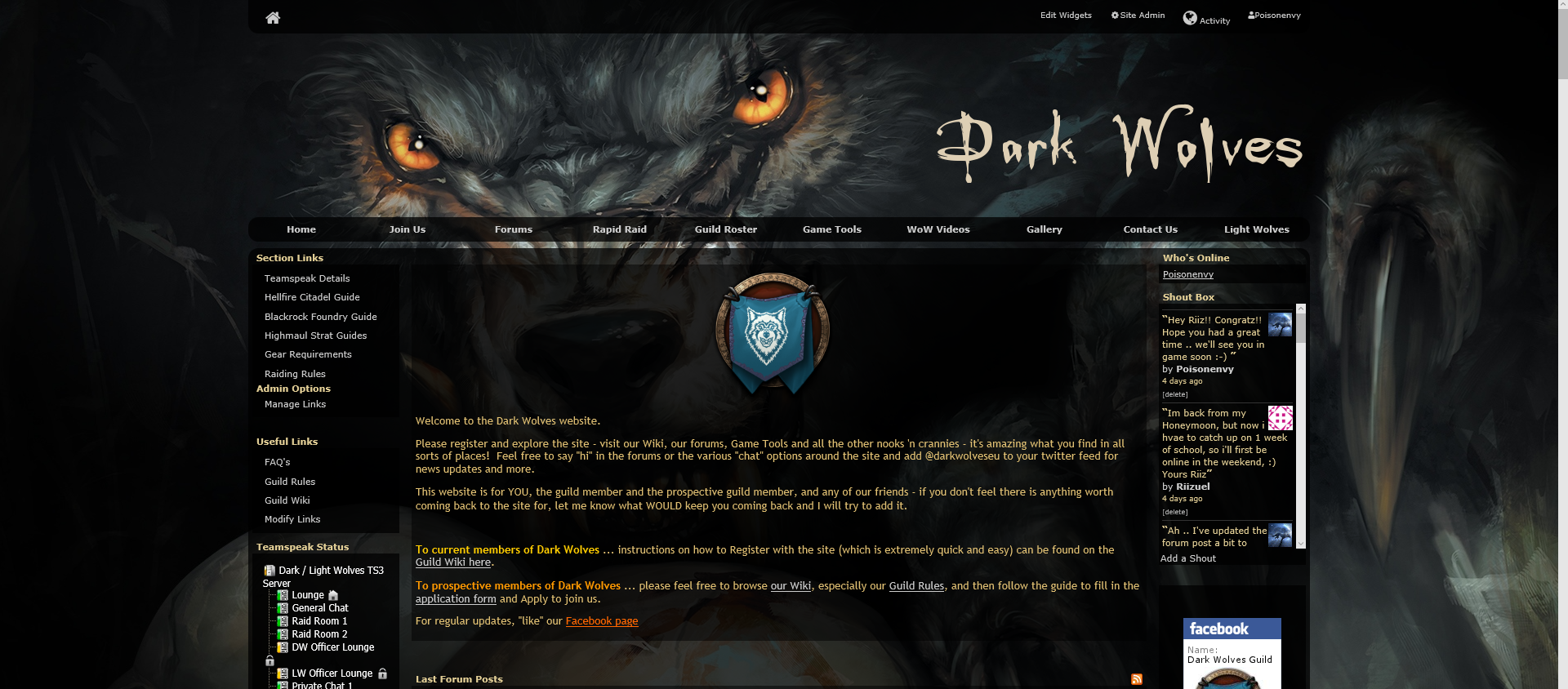
To compare, this is a screenshot taken a few months ago:
|
|


