Site Update


Glad you like :-) There are still a few tweaks to do .. and some of the previous forum posts, etc, still reflect a different formatting style to the current one (most noticeable on things like quotes), but hopefully any new posts will reflect the new style.
I was going to review the Guild Rules .. primarily the guild ranks, as I've had one or two ask me about them soon after joining us. But I'm not sure how to make it any clearer - I'll have a think on it, but I suspect that, especially with the Rules previously being a lot longer (incorporating the raiding rules too), perhaps people didn't notice. Or perhaps they just fibbed a little bit when they said they'd read them :p
I have, I think, sorted out the "Latest Forum Posts" widget - previously when you clicked on a link it would take you either to the first post, or some seemingly random post within a thread .. hopefully it should now take you to the post it is referring to. Although for those of you who were having problems with the site logging you out when you switched urls, it may still cause that problem, because I notice it uses the host url rather than ours. If that happens, let me know and I'll get it reported.

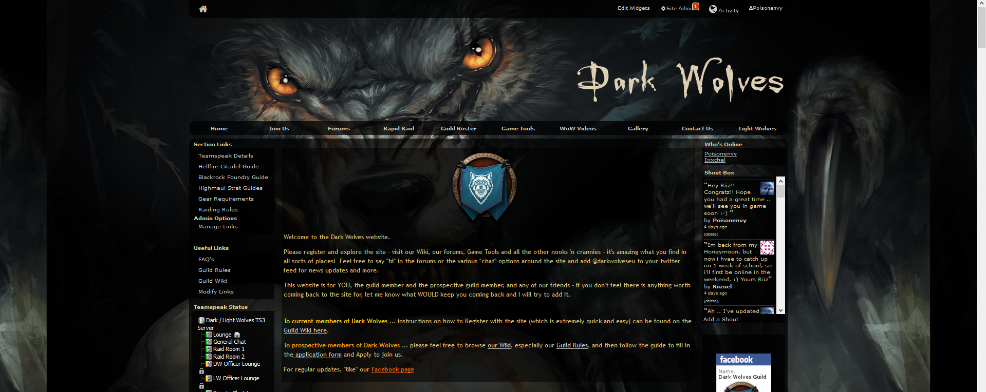
I find it a bit odd that when you log onto the site (or even visit without logging in), that the top third of the screen is basically blank until you start scrolling down. The picture of the wolf is visible, but I prefer the way it fades into the background as you scroll though the page. Personally, I'd prefer a little less empty space as the first thing you see when you visit. Perhaps have the guild name in a banner at the top and move the main part up to join it?

I find it a bit odd that when you log onto the site (or even visit without logging in), that the top third of the screen is basically blank until you start scrolling down. The picture of the wolf is visible, but I prefer the way it fades into the background as you scroll though the page. Personally, I'd prefer a little less empty space as the first thing you see when you visit. Perhaps have the guild name in a banner at the top and move the main part up to join it?
Hmm .. can you screenshot that and show it? There shouldn't be any blank space at the top.
Or do you just mean that there is just the header there (wolf eyes, etc?). It was virtually the same on the previous site if that's the case .. although it was a slightly smaller banner then:
I could look into seeing if I can move the page up a bit?
I find it a bit odd that when you log onto the site (or even visit without logging in), that the top third of the screen is basically blank until you start scrolling down. The picture of the wolf is visible, but I prefer the way it fades into the background as you scroll though the page. Personally, I'd prefer a little less empty space as the first thing you see when you visit. Perhaps have the guild name in a banner at the top and move the main part up to join it?
I could look into seeing if I can move the page up a bit?
Okay I've moved the site up to approximately the same location as it was before - the only thing missing is the actual logo (the text saying "Dark Wolves") .. I haven't decided if that's necessary yet - but if people would prefer it to be there, let me know. I just need to find the right font for it and work out how to get it to show (in order to get it so that the "background" shows throughout the page, I had to make the "header" invisible - and I suspect the "logo" is part of the "header" ![]() ).
).
I've created a copy of this thread over on the Website & Forums part of the site, as that seems to make more sense to me. If anyone wishes to make any further comments on the new site layout, please head over to that thread:
http://www.darkwolves.eu//forums/viewtopic.php?p=38505748&gid=180473#38505748
I will now lock this one to prevent any additional comments being made here.