Site Update


Okay we're getting there .. with a bit of research and some help from our host, I've got the header a bit better, and transparencies ...

Layout over whole site looks like bigger spaces between lines; in forum the demarcation between forum headings and individual posts is indistinct. Headings and subheadings are similar in appearance (i.e. font, size and colour) so more difficult to distinguish. Just seems to be a lot more empty space which at present is a fairly boring grey although the transparency changes have helped that a little.
I'll get used to it :)
Perspi

I think the spacing between lines is just dependant on the font size .. and it's slightly bigger here than the previous site, so therefore the space between lines is slightly bigger.
The demarcations .. I agree .. I'm looking into potentially having alternate forum posts in a thread slightly different colours to make them more obvious.
I'm also looking into changing the colour of text in "quotes" .. colour of text I should be able to tweak, although I quite like the main font colour (ie, this one), but if people are struggling to see it, I can tweak a bit.
Heading and sub-headings? I'm working on changing some because they haven't transferred over properly, but could you point to a specific example where the headings and sub-headings are too similar, just so I know which area we're talking about?
A question for those who have been having a play with the new forums ... we have an option to have the "quick reply" box on or off.
The quick reply box is, as it sounds, a box at the bottom of a forum thread where you can quickly type in a reply without having to hit the "reply" button first. The advantage being, of course, that it is much quicker and easier.
The disadvantage being that some options, such as including smileys and, I think, some formatting options, aren't available on the quick reply box - and if you decide part way through a reply that you want to use those things, you have to then switch to the "advanced reply" ... which unfortunately does not store what you've already written. So unless you copied it prior to switching, you have to retype.
Which would you prefer? The quick reply box being there, or not?
I think it's just that everything that all the forum headings & subheadings, & the post headings are all the same colour blue so it's difficult to see the hierarchy of the entries. Maybe this wouldn't be a problem if the demarcation was clearer.
I'm just too set in my ways; all change is resisted :)
Perspi
Do you mean this bit:
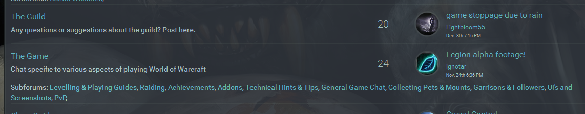
The forum names, sub-forum names and latest post in a forum have always been the same colour, even on the old site, because effectively they're hyperlinks (links you click on to get somewhere else) - and all hyperlinks are given the same colour.
I can change the colour of them, I think, but they would still all be the same colour, whatever it was. Is it perhaps that the colour of the links is too similar to the non-link colour?
The thing I would say about the above screenshot is that I'm not happy about the fact the sub-forum headings/links go right across the screen - as far as I'm concerned they should go no further than the topic count number - but unless I split that particular section so that it has less sub-forums, currently I don't think there is anything I can do about that .. I think that's something that needs to be dealt with at source by our website host.
Yes PE I did mean that bit. Maybe I'm just being too reactionary. Old forum seemed much easier to work out what belonged to what and where I could find what I wanted and I hadn't actually realised all the headings etc were the same colour till you pointed it out
I'll leave you to it now. I've done enough moaning
Perspi
haha it's not a problem persp .. I don't know what is a problem, sometimes, until someone points it out.
With our hosts help, I've managed to sort out a couple of other problems, but currently there are two or three that are on their bug/do to list.
The Widget showing rapid raid loot, in some browsers, is not displaying correctly - this is a known bug that they're working on.
The sub-forum headers, I don't think, are right .. I've brought it to their attention and hopefully something will get sorted with that at some point .. this is what I've sent to them (explaining that I'd like the sub-forums list to be the same width as the example under "Absences and Farewells"):
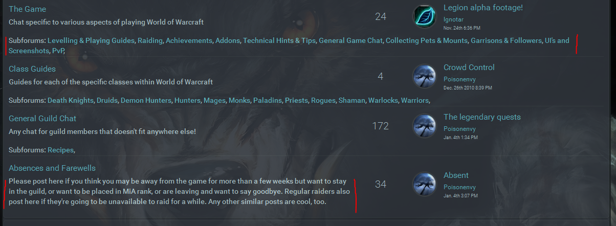
I suspect that, if they're more obviously UNDER the heading rather than all the way across, it will make it more obvious that they are actually sub-forums.
If the worst comes to the worst, and nothing gets sorted that way, I'll just work out a way to split those forums, or rearrange the forums, so that they're easier to see.
There's also a problem with text font size still - I may be able to sort that myself with time, I'll have to look into it. I think you're possibly right about the line spacing .. but I'm not sure so will look into it. It may be standard for this font, or they may have set it slightly higher.
And the other thing that needs sorting is bulletpoint/lists .. they aren't quite right yet .. font sizing and display.
Still haven't decided if I've finished tinkering with "quoted" sections either :P
As you know I've updated the forums so hopefully they look a bit better (I've also updated the FAQ to give a bit more info about them). I'm currently in discussions with Guildlaunch to try and track down a problem I've been having with the look of the site .. see previous and more recent posts regarding the "hinky" site layout! ... currently we suspect it may be some combination of Windows 10 and Firefox .. but will let you know.
This primarily affects those who have problems switching between the two URL's used on the site (darkwolves.eu and darkwolves.guildlaunch.com).
And of course, anyone else who has encountered a slightly "squished" looking site in Firefox.
One thing I have noticed since the update, and I don't know if it's just me or not is this:-
When I log in and immediately click on the forum tab, the site logs me out and I can only see the public forums, I input my login details again and everything is ok. So I am effectively logging in twice every time I visit.
Not sure if there's anything can be done or not, but thought you should know!!

Yeah Kath mentioned the same thing .. it's something to do with the fact that, effectively, we have two domain names .. we have "ours" .. darkwolves.eu .. which is what the main page is normally at if you arrive normally to the site, and then we have the darkwolves.guildlaunch.com address - which is what our domain name is supposed to overlay. However, I'd been having problems with the site looking weird whenever I logged in using one of the addresses, so we (myself and our host) were trying to work out what caused it. We've sorted that now (basically it was me being stupid!), so I'll be able to change SOME of the URL's back to the normal address.
Having said that .. once I've done it (probably tomorrow now), some of the page addresses will still default to the guildlaunch one, so it may still happen. I think it's something to do with security software that eats cookies and password-savers (when you switch from one base url to another it automatically "forgets" the password).
If it still happens after that, let me know and I'll report it. I'll post on the site once the links are updated.
Right .. hopefully I've now amended all urls so they're our domain name ones. If you come across any that use the guildlaunch url instead, please let me know. If anyone still has any problems with the site logging them out as they switch pages, let me know which pages you were on (before and after) and I'll look into it.
I've now added the new Teamspeak Widget that shows the settings for Teamspeak, and a link to the full page. Hopefully it will make it more obvious (not that I thought it was particularly difficult to find before!). In THEORY this widget should only be viewable by guild members who are logged in to the site. I've tested it by logging out, and I couldn't view it .. however, there is a bit of a grey area as far as prospective members are concerned (who have submitted an application form) or who is a member of another site on guildlaunch - I'll aim for clarification at some point from our website host.
I've also amended the guild rules page. One of the graphics looked wrong, so I've redone it, and I've split the guild rules so that the raiding rules are in a seperate section. I've given a brief overview of our raiding rules on the main guild rules page, but reduced the length of the page fairly extensively - prospective members don't need to know specifics about loot rolls or a host of other minutia. And if they do, there is still the link and the option to read up, from that page.
Let me know if there's anything else you spot ![]()
Hurrah!
There are still a few things I need to sort out .. there is something weird going on with the "go to last forum post" widget, because basically it tends to suit itself as to which post it takes me; I need to streamline/improve navigation a bit (I'd like to try and get all the raiding related links, and all of the "general info" links in one place, ideally a drop down) aaaand ... there was something else that I've forgotten now. Oh .. and that bit of info in the browser tab ... but I'm going to give me brain a brief holiday.
Oh .. and I need to tweak the guild rules a bit .. apparently it isn't obvious what all the various ranks mean, so I'm going to try and make it more obvious. If I remember :p